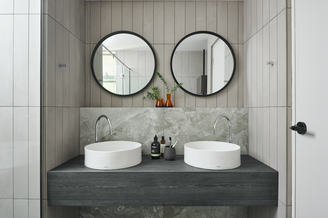
This bathroom by Studio FortyFour uses a combination of tiles, and a contrast of lines and shapes to achieve its sharp-suited contemporary look.
Loved for their easy-to-clean water-resistant qualities, tiles have been used mainly in bathrooms and kitchens for these reasons, but the material is getting a new rep. In addition to their functional edge over natural materials in terms of durability, and ease of installation and maintenance, trend-forward tile companies and creative designers have also give the humble tile credibility as a decorative material. The works of Studio FortyFour, a local interior design firm founded by former schoolmates Wilson Teng and Vandra Png, champion the use of tiles for both function and aesthetics. We spoke to Wilson to get his insights on how his firm utilises tiles to create spaces that their clients can’t help but fall in love with.
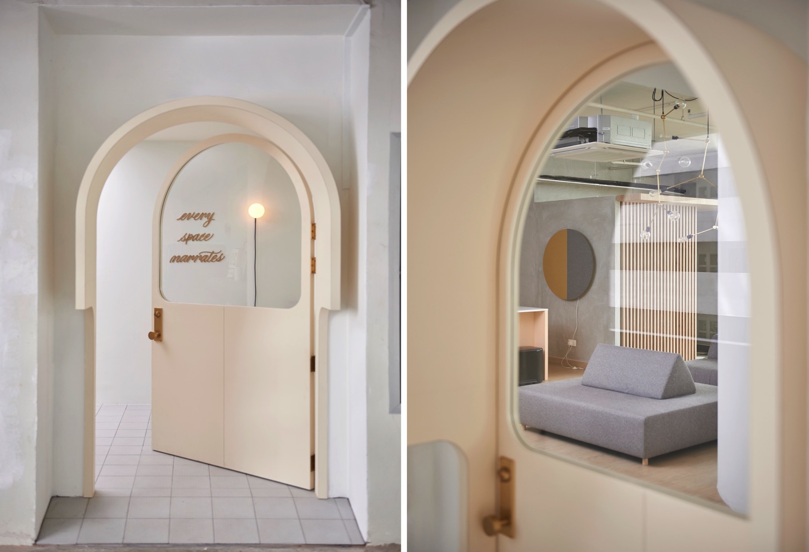
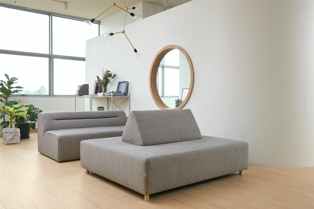
The Panaria Chic Wood timber-inspired tiles in Honey Nat conjures a warm welcome to the office and has anti-microbial qualities too.
The flooring of Panaria Chic Wood timber-inspired tiles in the lounge area of the office creates a sense of familiarity and warmth. This is coupled with the crisp shapes of the dramatic arched door entrance and a circular window opening to wake up the landscape of calm tones. “In the design of our office, we also wanted to showcase the marriage of technology, craftsmanship and design in our work, by using machinery such as the CNC machine,” explains Wilson. For example, the canopy at the top of the entrance doorway was formed by piecing together 10 pieces of plywood precisely cut by the CNC (Computer Numerical Control) machine.
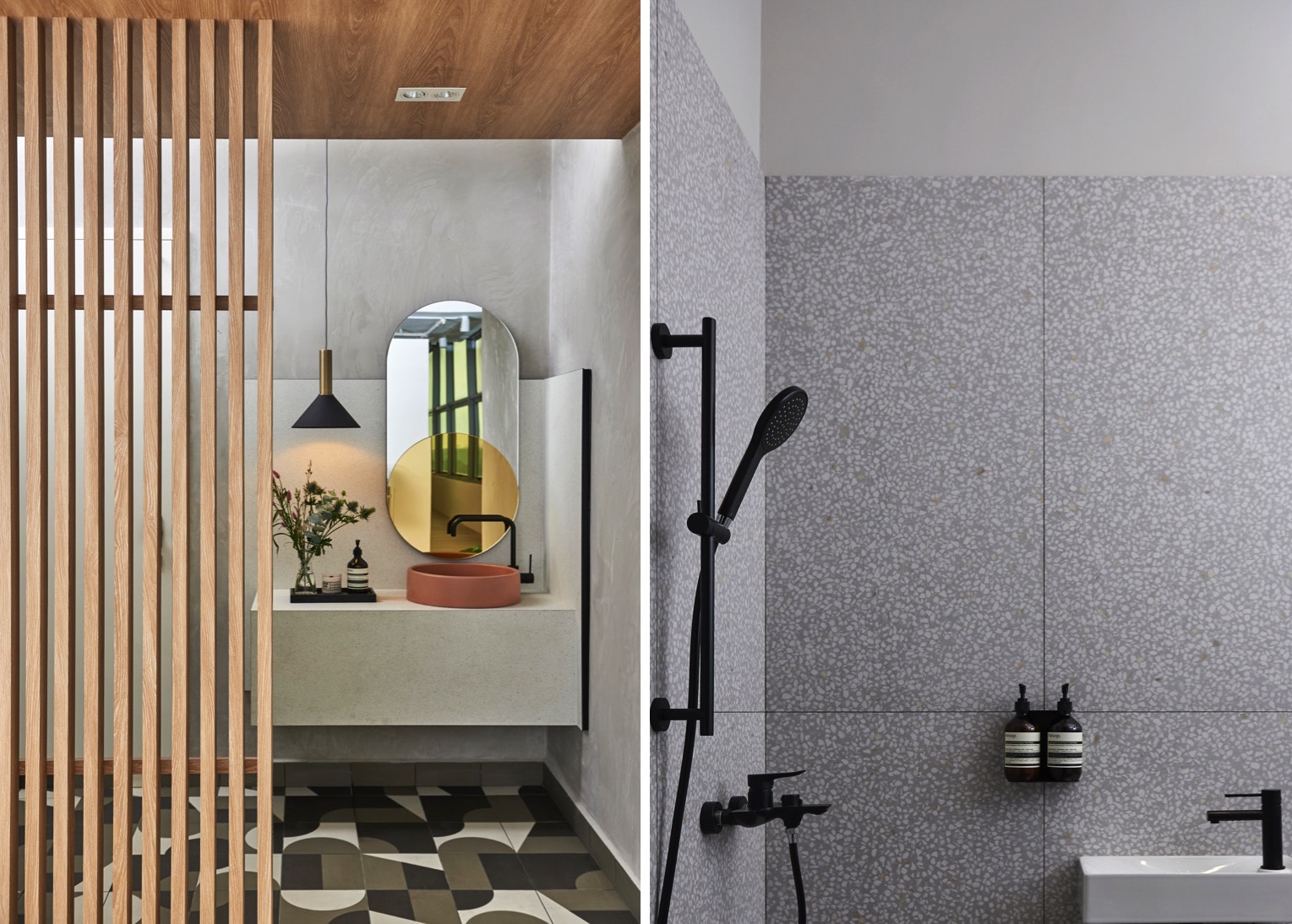
Mutina Puzzle Gotland is a bold choice for this compact bathroom. The right proportions of shapes, and balance of pattern and colour create a gorgeous contemporary space. In the shower area are terrazzo-inspired Portofino Humo tiles by Vives Ceramica in the size 600mm by 1200mm.
A fan of the Dutch De Stijl design movement in the 1920s that severely restricts design to rectilinear shapes and primary colours, Wilson has also adapted some of the movement’s ‘rules’ here. This can be seen in the shapes that populate the office interiors, including the circles, lines and elongated ‘pill’ of the bathroom. Amidst the formal shapes, the Mutina Puzzle tiles on the floor act as an expression of freedom, with their seemingly random pattern, which actually took a long time to arrange! “The energy of the tiles makes them visually interesting in a small space and they look busy but not messy,” says Wilson.
The Vives Ceramica Portofino terrazzo-inspired tiles of the shower area seem similarly busy, but as with the Mutina tiles at the entrance, the details of the ‘noisy surface’ start to emerge upon closer inspection.
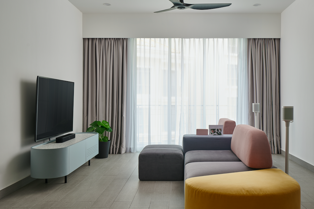
The Ergon Tr3nd collection tile in Grey Wood Nat on the floor is durable and easy to clean.
Tiles are also on show at one of Studio FortyFour’s residential projects, a condominium unit belonging to a couple in the thirties with a young child. The living room flooring of timber-inspired Ergon Tr3nd tiles in Grey Wood Nat is easy to maintain and a durable choice for the young family. The customised furnishings in the living area sport rounded edges to create a safe environment for the child to play in.
Wood tones always provide a sense of warmth and cosiness to a home, and as timber becomes more difficult or expensive to obtain, use, and maintain, tiles can be a great alternative. “Visually and texturally, timber-inspired tiles are now very close to natural wood, and can speak to your emotions like the natural material. Over the years, we have also gotten used to the feel of tiles against our feet or skin,” says Wilson. Some tile patterns, such as Peranakan motifs or retro mosaic can even trigger feel good emotions of nostalgia.
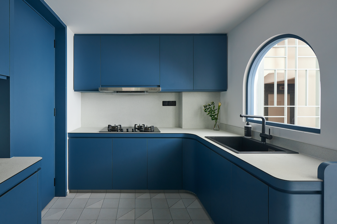
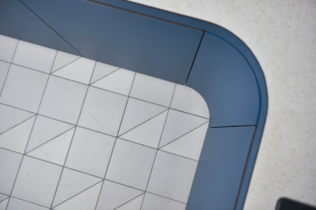
Cutting some of the Mutina Tape Mesh Blue and Base White tiles into triangles creates a contrast of pattern and colour on the kitchen floor for a playful vibe.
“The couple’s first home was formal and executive-looking, and when they had a child and bought this place they wanted their new home to grow with their daughter,” says Wilson, of the colours that add a joyful vibe to the space. The owners had asked for a blue kitchen and having fallen in love with the Mutina Tape tiles in Studio FortyFour’s office, they wanted to use the tiles in their kitchen. A note of playfulness was added by cutting the square tiles up into triangles and contrasting them with Base White tiles from the same collection. A sea of blue laminated cabinets brings out the blue of the tile pattern.
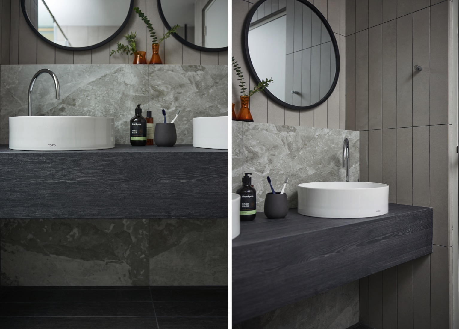
Wilson puts the spotlight on the marble-inspired Edilcuoghi K_Griege Levigata Opaca tile in the master bathroom by pairing it with the plain-coloured Ergon Tr3nd Grey Concrete Nat tile which has been cut into strips.
Tiles also take center stage in the master bathroom, designed with a calibrated balance of colour and pattern. The homeowners requested to use the dramatic marble-inspired Edilcuoghi Edilgres K_Griege tile in the bathroom after seeing it at riceLAB, and Wilson obliged. To show off the unique veining pattern of the tile, he set them against a background of plain grey Ergon Tr3nd concrete-inspired tiles and placed them directly behind the washbasins so they are in the homeowners’ direct line of sight when they are using the faucets.
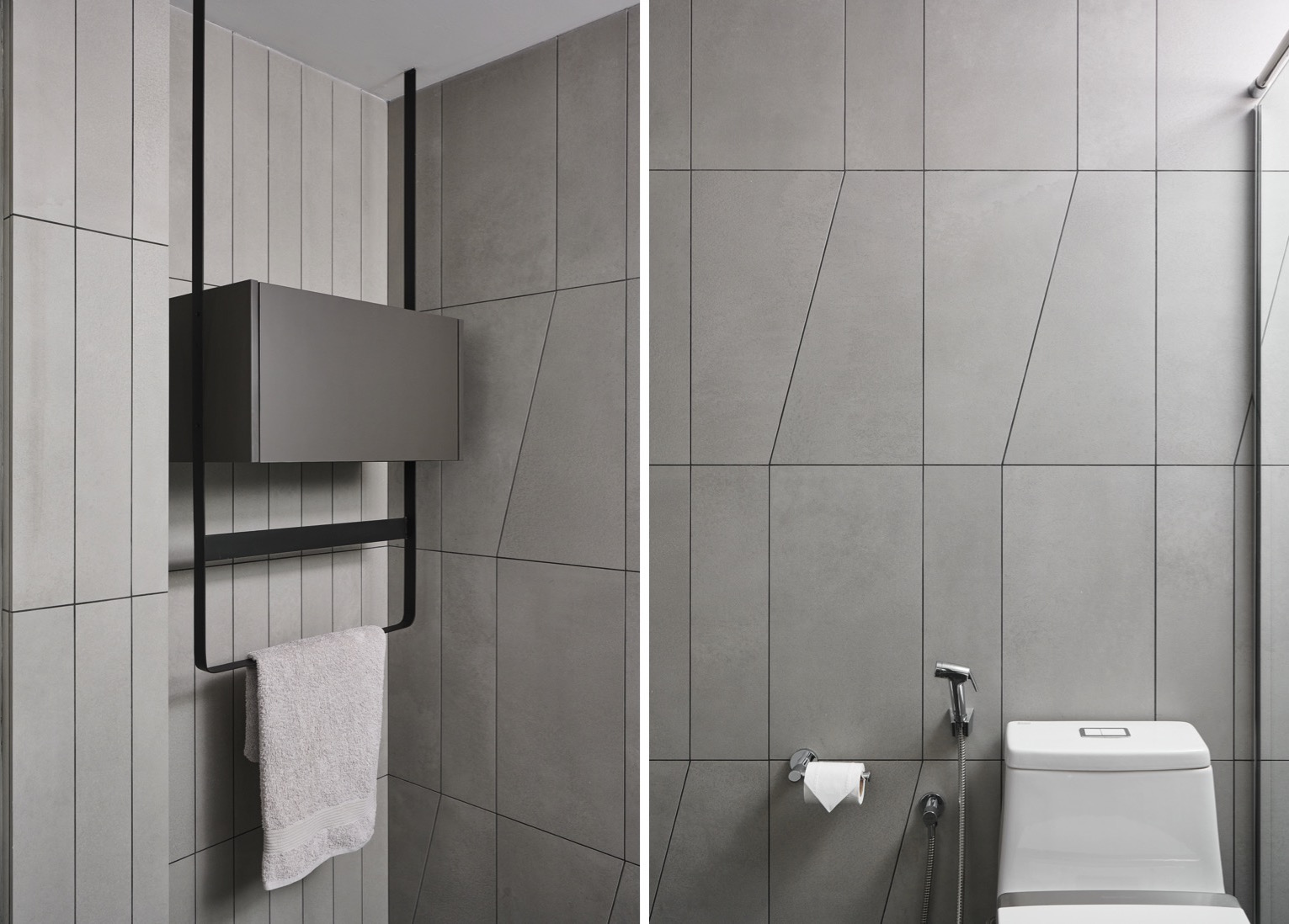
Resembling a sharply tailored suit with its clean and crisp lines, the master bathroom channels the executive look of the couple’s previous home with its concrete-inspired Ergon Tr3nd Grey Concrete Nat tiles cut into various repeated shapes.
The rest of the bathroom features the same Ergon Tr3nd Grey Concrete Nat tiles on the wall, but with a difference. Instead of leaving the tiles in their original rectangular 300mm by 200mm shape, Wilson cut the tiles into shapes inspired by origami. The pattern formed by the grout lines adds extra visual dimension to the plain surface without it looking too busy or complicated.
Tiles can do wonders, according to Wilson, but to achieve the best outcome he has some advice for homeowners. If it’s possible, bring the full size tile sample to the project location to see how it looks in the actual space. Light can affect the perception of colours, and every home has a tint because of the light from the environment.
In the bathroom, he advises homeowners to choose floor tiles of smaller sizes that can easily be used to adjust the gradient to aid water drainage. “Even if you choose large tiles, they have to be cut to create a gradient,” he says. Homeowners should also be mindful of tile textures to ensure safety, for example using tiles with a higher slip resistance for wet areas such as the bathroom.
“Tiles should be one of the first materials you choose for the home, as they cover a large area,” he shares. Ordering them early on in the renovation will also help mitigate issues of stock availability and shipment delays.
All images courtesy of Studio FortyFour.
Find out more about the tiles featured above at riceLAB by emailing us here, or call 6692 1199. RICE is temporarily closed due to the circuit breaker. Our team is still operational and contactable by phone and email during our temporary business hours of 9am to 6pm, Monday to Friday. Please continue to visit our website to make your material selections.
Get the European tiles you love at great prices! Browse the Tile Me You Love RICE range on our website in the Materials tab, using the filter Tell Me You Love RICE.
Latest Post
Slither into the New Year with Harmony & Sophistication, along with PANTONE Colour 2025 - Mocha Mousse
Don’t miss these 3 RICE Tile Collections that best depict these Interior Designers’ Design Aesthetics
5 Local Renovation Projects that RICE Proudly Calls & Goes ‘Home’ to


