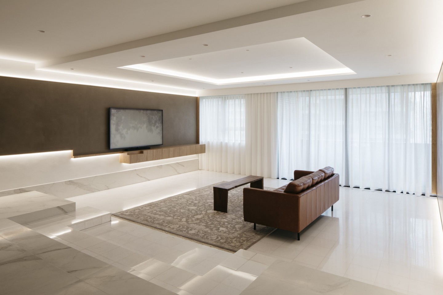
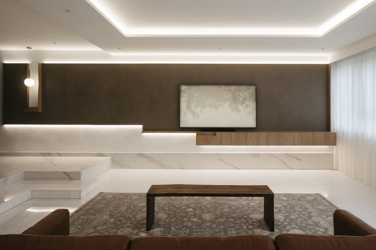
The new Cercom To Be marble-inspired tiles at the entranceway were chosen to harmonise with the original marble of the lower floor of the living area. The perfect square on the false ceiling reinforces the orderly geometry of the area.
Design challenges can often lead to delightful outcomes. Savouring the process and letting the ‘objective’ aspects of a project guide them to original and unexpected results is the modus operandi of Metre Architects. “We see design as synthesis of the objective and the subjective. The objective entails quantifiable data such as brief, floor area, budget, and timeline. The subjective embodies tastes, preferences, and feelings, of both clients and designers alike,” explains Woon Chung Yen of Metre Architects.
In the case of this 37-year-old 3,210 sq ft luxury apartment along Orchard Boulevard, the task given to Woon and Ian Wong Hengjie was to convert the apartment’s existing four bedrooms into two, with a guest bedroom, for the family of three. The bedrooms were shaped like wedges which radiate out towards its semi-circular perimeter wall, and they were blocking sunlight from entering the common area. The only source of light into the home came from the balcony at the side of the living area.
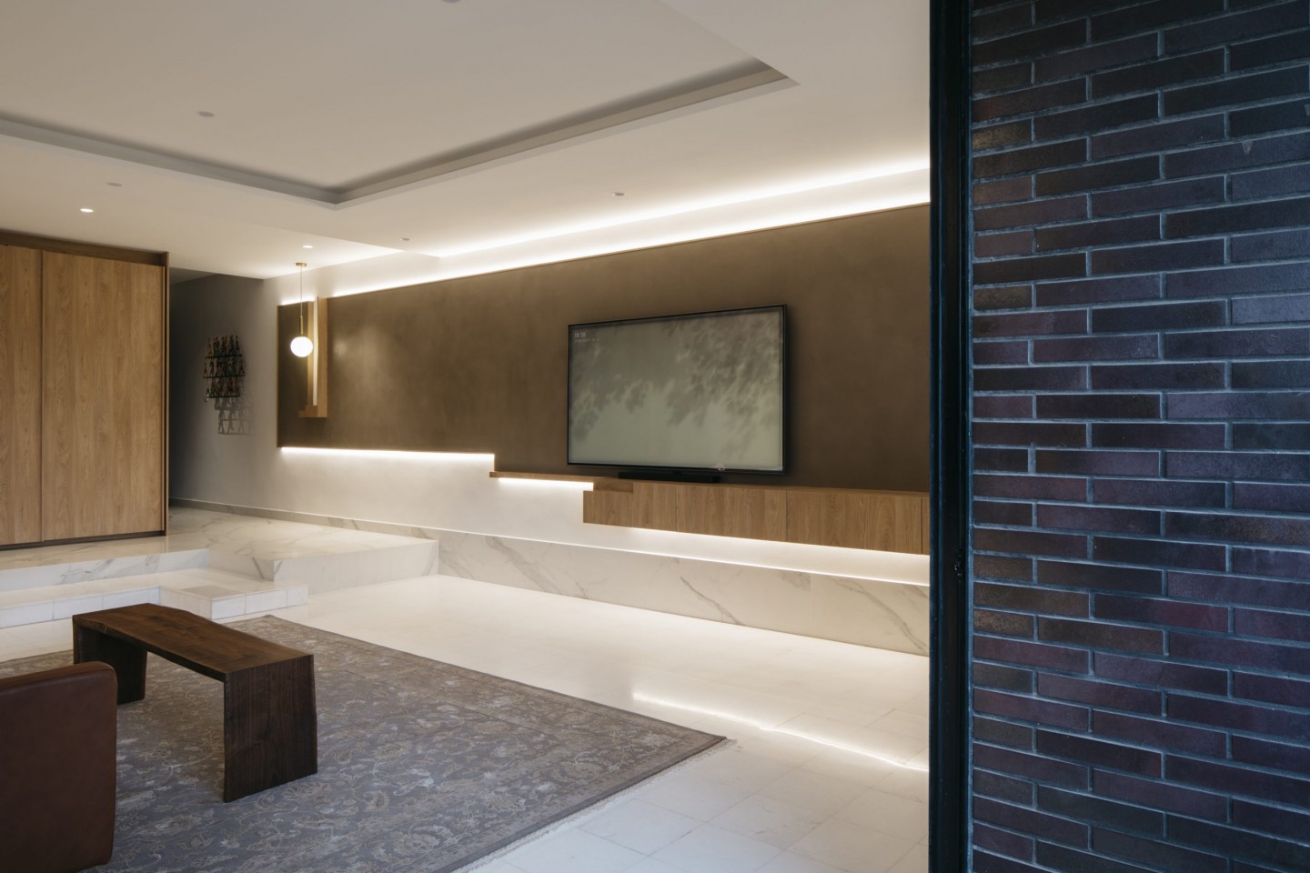
The outline of the mid-tone feature wall echoes that of the tiered steps into the living area. The extrusion from the TV console adds a measure of three-dimensionality to the design and creates a sense of movement. The brick wall marks the balcony area.
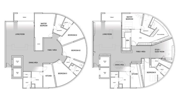
Before and after layouts of the apartment
Bringing light into the home was crucial, and that was accomplished by removing one bedroom and turning the space into a multi-functional zone that can be left open or closed up to be used as a guest bedroom or study. Enhancing this new axis of daylight is the flooring of white Cercom To Be Statuario Satin marble-inspired tiles in a large format size of 100cm by 100cm. The large tile size renders an almost visually seamless look which starts at the entranceway and flows throughout the common areas. “In this project we used large format floor tiles in a matte finish as a pristine base to the apartment, their low sheen giving just that right amount of reflection,” says Woon. “We use tiles often in our projects because they are one of the most tried-and-tested and easy-to-maintain materials, with almost limitless patterns and effects to choose from.”
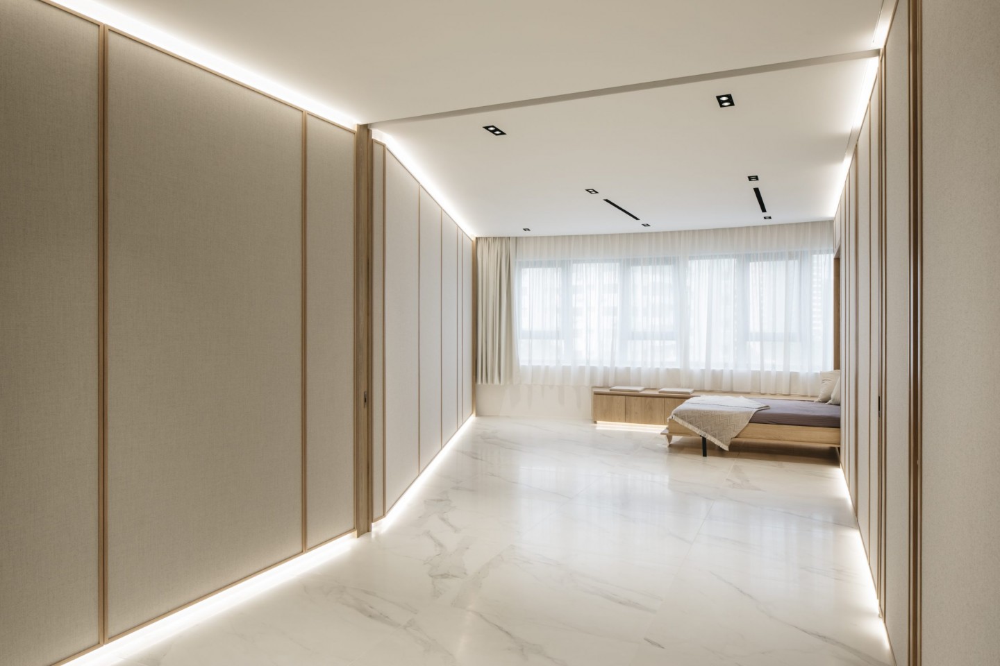
One of the original bedrooms was removed to allow light to flow into the dark centre of the home. The Murphy bed folds down and pocket sliding doors close up the space to be used as a guest bedroom when required.
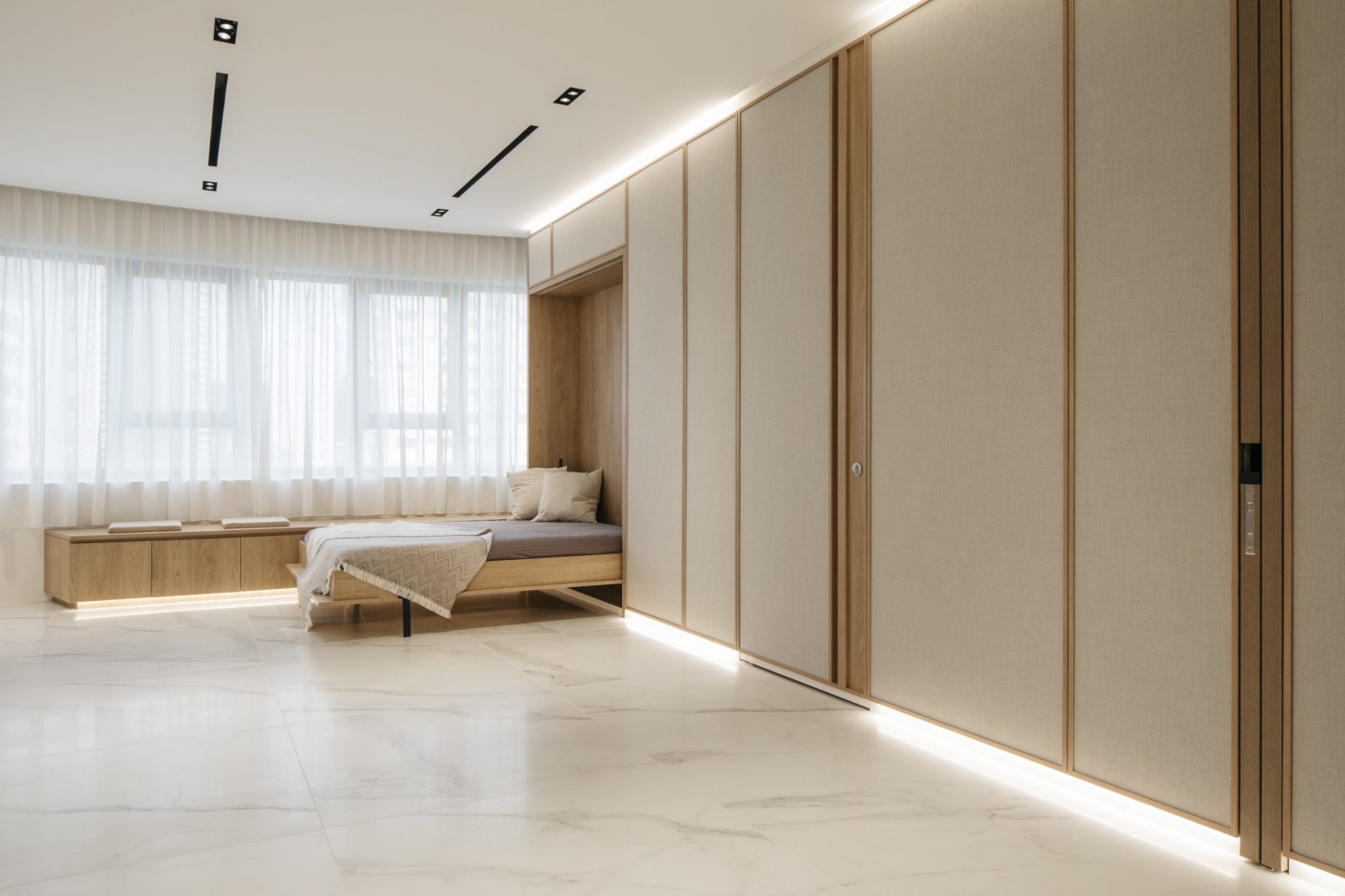
The Kvadrat fabric that clads the walls flanking the new open plan space within the apartment sports a distinctive triangular weave pattern, which approximates the look of Japanese rice-paper.
In addition to the new flooring, the team also paid particular attention to the lighting design of the interiors, not just with lamps but also playing up the illumination with shadows. They introduced a trio of dark, medium and light tones, applying them with materials in various parts of the home. The ‘dark’ and ‘medium’ feature wall panels were finished in semi-gloss textured paint to catch the reflection of light depending on the angle of view. The ‘dark’ panel lines the entry wall, and the ‘medium’ panel backs the TV in the living room. The cream-coloured fabric-clad wall panels of the new interior boulevard represents the ‘light’ tone. The lights lining the top and bottom of each panel emit a soft glow that provide a sense of lightness to the structured designs.
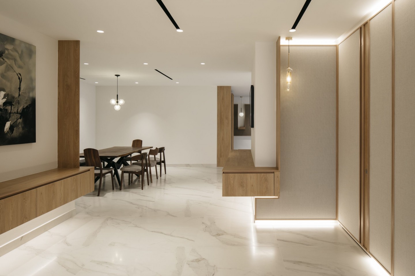
A view towards the dining area from the family area. LED strips lining the top and bottom of the framed fabric panels act as both functional and accent lighting in the home. Pendant lamps become location pins for the various spaces.
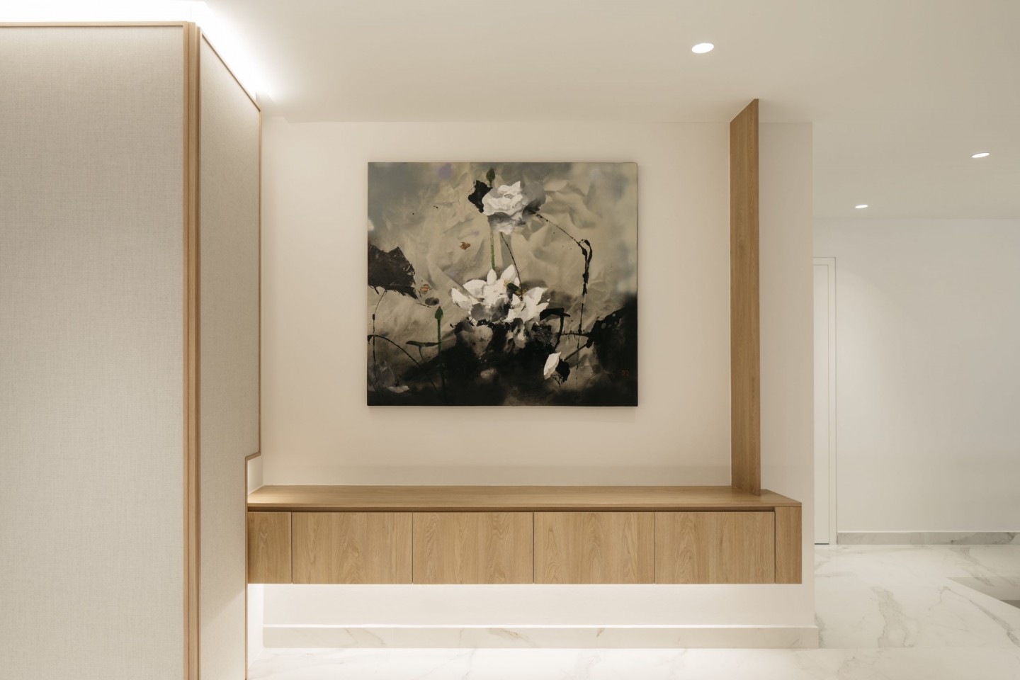
Ample wall space was provided for the owner’s art collection. The wall panels are framed with veneer to evoke a sense of craftsmanship and complement the cabinetry works.
In a nod to the apartment’s original interiors, the team conserved the tiered steps leading down into the living area. They also kept the white marble flooring on the lower floor and steps, finishing the upper floor and skirting in the new large-format Cercom marble-inspired tiles for consistency and harmony. To accentuate the steps and tiered floor heights, the skirting line continues across the upper entry area over into the living area. The tiered steps, which Woon says is a rarity in new apartments, also lent inspiration to the irregular rectilinear design of the feature wall, creating a sense of movement in the space. In keeping the positive aspects of designs from this era, they had managed to invigorate the apartment with contemporary functionality and aesthetics.
Photography: Studio Periphery
Renovation Contractor: Stema Furniture & Renovation Pte Ltd
Design and photos: Metre Architects
Explore the tile featured in this home at riceLAB. Visits to riceLAB are strictly by appointment only and limited to four people per group. We encourage guests to make their tile selections online at www.rice-fields.com before coming down to minimise their time spent at riceLAB. Make an appointment by emailing us here or by calling 6692 1199. riceLAB is at 213 Henderson Road 01.03 Singapore 159553. RICE is open from Mondays to Fridays 10am to 7pm, and Saturdays from 10am to 6pm.
Get the European tiles you love at great prices! Browse the Tile Me You Love RICE range on our website in the Materials tab, using the filter Tell Me You Love RICE.
Latest Post
Slither into the New Year with Harmony & Sophistication, along with PANTONE Colour 2025 - Mocha Mousse
Don’t miss these 3 RICE Tile Collections that best depict these Interior Designers’ Design Aesthetics
5 Local Renovation Projects that RICE Proudly Calls & Goes ‘Home’ to


